
Creating content for an energy company
Company
National Energy Services
Industry
Energy
Services
Visual identity, learning & development, film & editing, motion graphics, UI design, publication
About
National Energy Services (NES) is the UK’s home for independent energy assessors for residential, commercial and under construction properties. They promote the highest standards of quality, through training from industry experts, user-friendly software and technical support.

Challenge
NES required all their content to be updated in order to remain true to their high-quality standards by giving their products a modern look. This included all their eLearning courses, sales and marketing material, technical videos and specifically the new app they were developing. They also needed to bring consistency to their brand across the organisation and streamline their processes in order to remain competitive within their market.

Users & audience
The target users for this brand were mainly energy assessors who were signed up to the NES scheme and required continuous professional development in order to retain their license. This audience group were from a mix of backgrounds from the age of 18 onwards with preferences towards technical detail. Anything that was to be designed had to be concise and visually appealing. The secondary audience were people that were yet to join the scheme, this included users who were training to become energy assessors and those who were yet to make the career change.

My role
I was hired as Creative Content Producer, reporting to the various heads of departments for respective content and straight to the Managing Director for the stylistic direction of the products. I was tasked with updating the company’s eLearning library and technical videos, as well as the UI design for their mobile app. I also supported other departments with design services that would help them market their services more effectively. This included responsibilities such as the brand’s visual identity, UI design and learning and development.

Visual identity
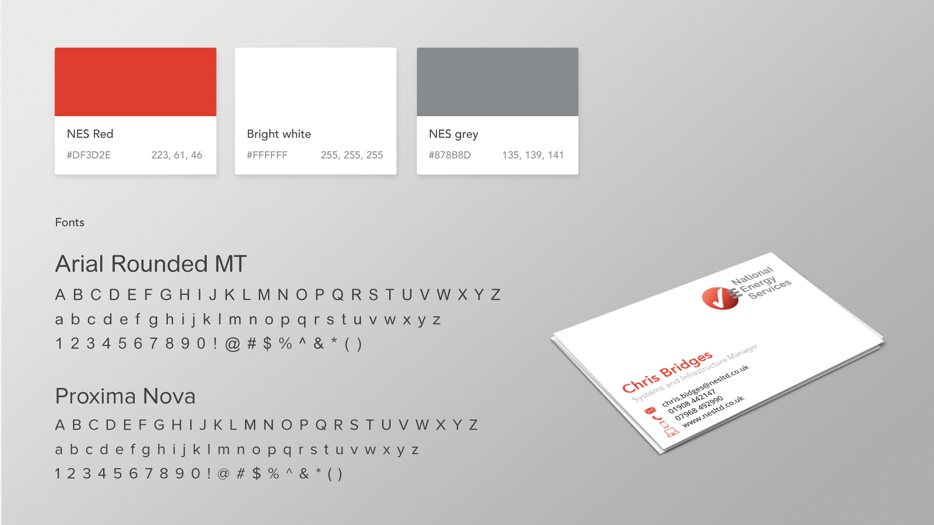
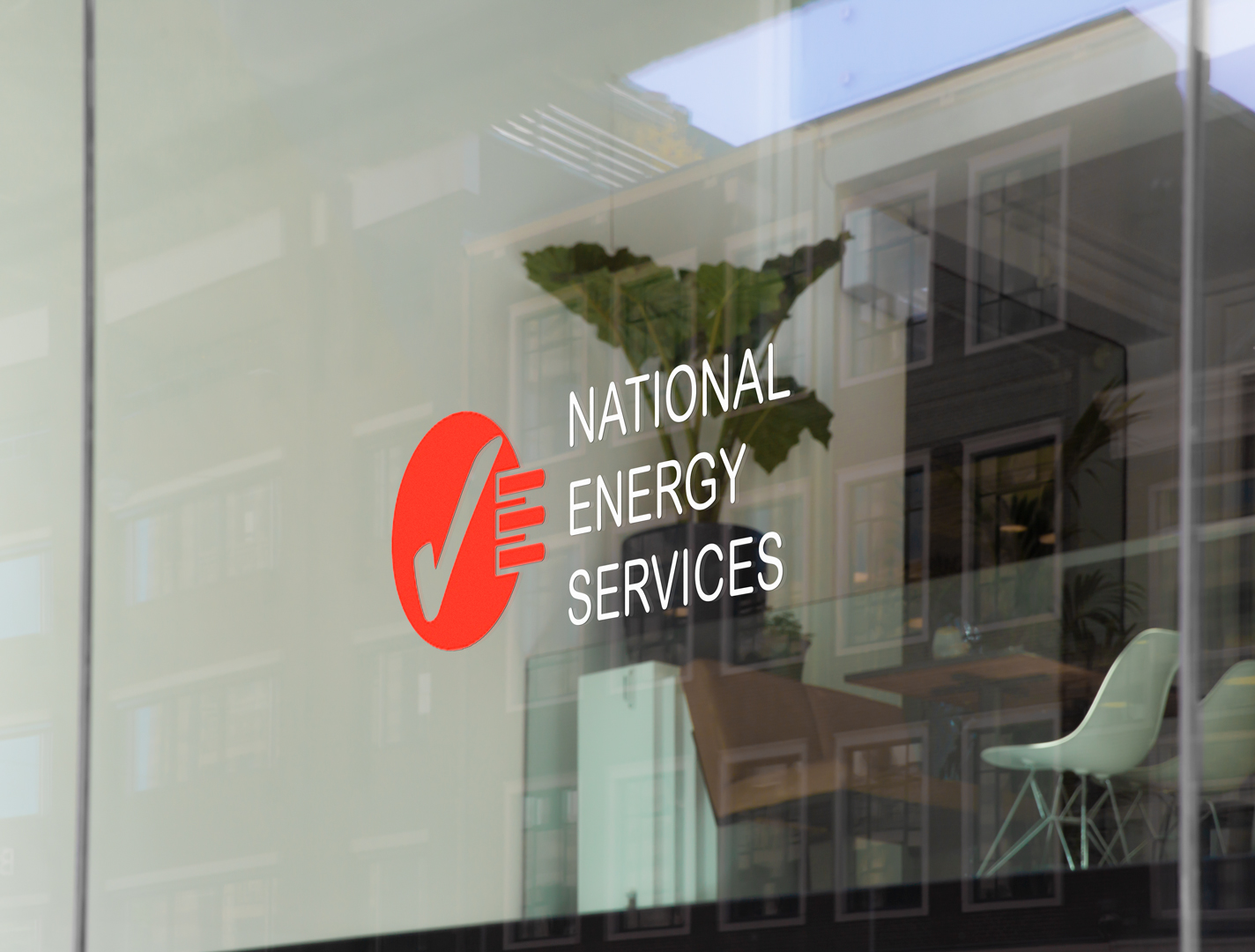
The visual identity work for NES included creating logos for their sub brands and consistency in visual identity across their products. I first started by breaking down the company’s logo into its constituent parts including typeface, colour tone, shape and communicating idea. I then workshopped ideas with members of the various teams who worked on the sub brands to understand the functionality and values associated with them. This allowed me to create imagery that would help to communicate what each brand did without the need of the name. I then pulled a colour palette for each brand from their respective products and made a suite of logos that were similar in style, but different in appearance. I assigned a modernised typeface for all text, for consistency across the organisation also created all brand guidelines and other logos required by the business.


Learning & development
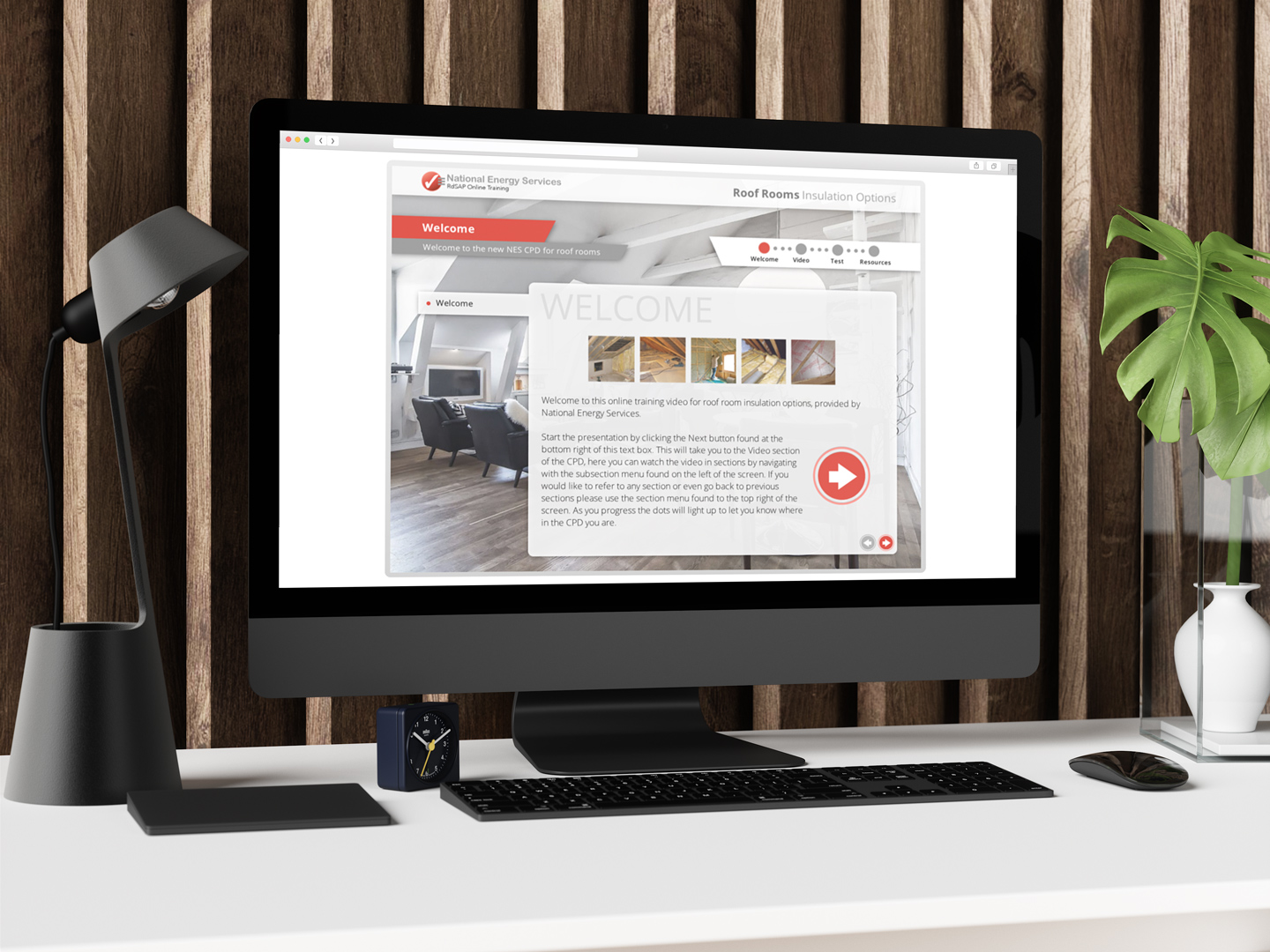
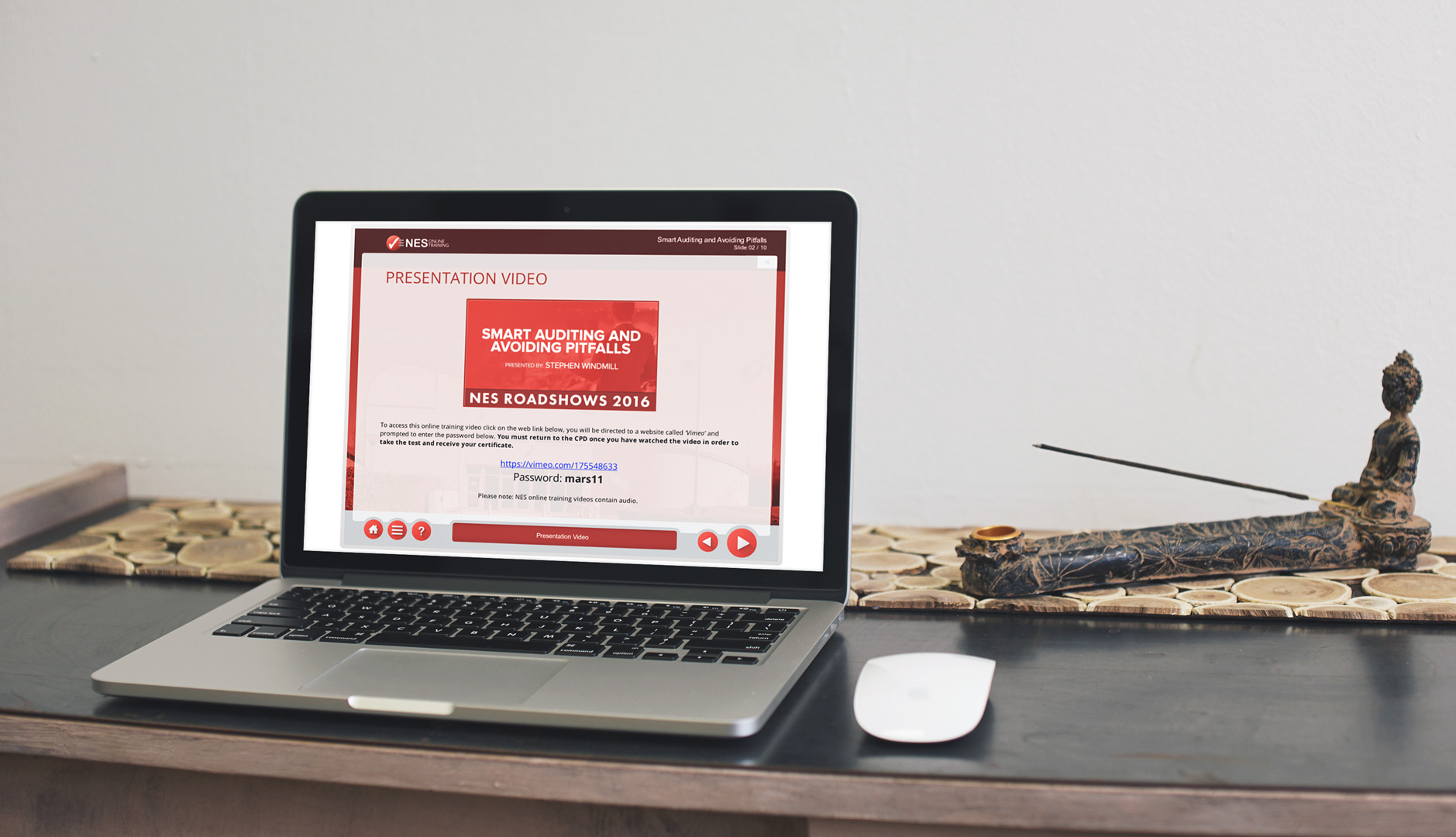
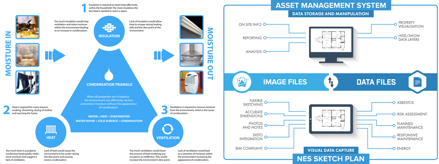
As part of this project, the company’s eLearning library required a major upgrade in order to meet modern expectations of digital learning. Their library was initially made up of basic PowerPoint files placed into Articulate Rise. Although this was a quick way for NES to create learning content, the quality and the impact of the training left a lot to be desired. In order to create effective training, I began with research and studied the course to become an energy assessor. This allowed me to understand the subject matter in depth, as well as the experience learners would go through, and importantly see where the gaps lay experience-wise in becoming an energy assessor. Following my accreditation, I ran a workshop with a focus group of recently graduated assessors and understood the user issues and therefore, what additional training was required. I made an eLearning template in Articulate Storyline aligning with the brand’s visual identity and used the common content from the Articulate Rise files and pulled it into the Storyline template. Finally, I worked with the Head of Technical Training to make sure the topics covered, and the information within, was still relevant and necessary and that any gaps in knowledge, such as changes to guidelines etc. were accounted for. Once the template and the library were complete, I replaced all the old files with new interactive, engaging and modern content.

Film & editing
As part of upgrading the company’s eLearning library I was required to create rich media content in the form of ‘how to’ videos, walkthroughs and technical explanations. I also filmed and edited videos to support their app and live presentations at their road show events. This helped to promote their products and supported the customers who used them, while the live event filming allowed the company to reach those who were unable to attend the event in person. This was important because the event would count as continuous professional development hours that the assessors were required to accumulate every year to keep their license.

Motion graphics
To create familiarity with NES’ visual identity, I created a consistent look to all the intros, outros and transitions for the videos. I also used motion graphics in the eLearning template and created 3D animation in Cinema 4D in order to communicate advanced construction concepts.

UI design
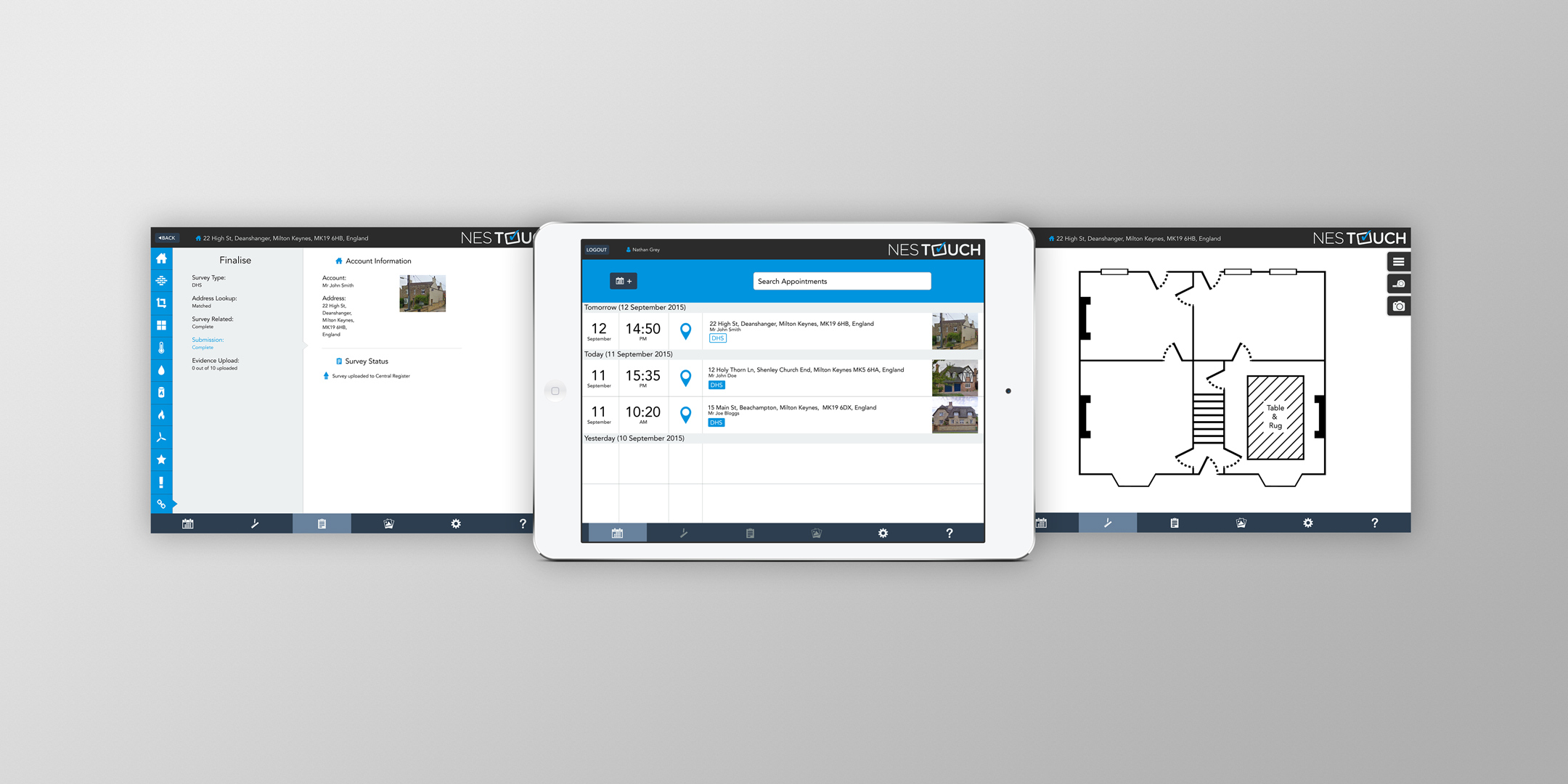
Working on user interface design for NES was by chance, as it wasn’t part of the original scope, but when a design agency failed to deliver on time, I was requested to provide my services to the NES Touch App Project. I started by making all the immediate changes to the original draft designs requested of the design agency and then worked on improving what they already had to make sure it aligned with the company’s wider visual identity to ensure consistency across the company. Additionally, I created an icon set and material to help with the app’s deployment.


Publication
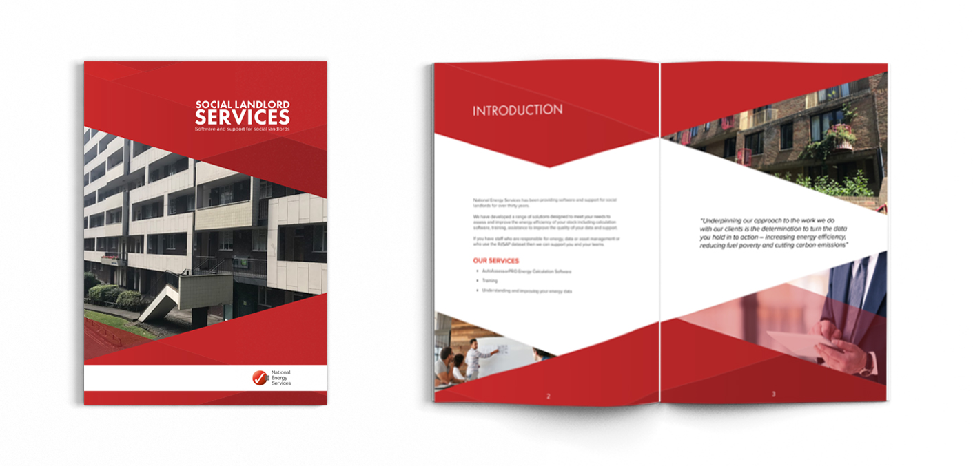
I delivered design work for the Sales and Marketing department to improve their Auto Assessor Pro marketing assets beyond a few PowerPoint pages. I facilitated a workshop with one of the senior sales representatives to discover ideas of how we could better deliver the selling points of the product to potential customers. I learnt the dynamics of how the sales usually occurred, what marketing channels worked best and what the customers preferences were. We arrived at the idea of creating a short brochure which would improve the quality of sales pitch and allow possible customers to take information away. I took the information from the PowerPoint and then placed it into a brochure template I created in InDesign and sourced a printer who could deliver the quantity required, at a competitive price.

Outcome
My time at NES was productive for both myself and the company. Most importantly I brought brand consistency to the company, developing brand guidelines with a strong visual identity across all their products. A stronger brand presence improved their reach and inevitably their revenue. I revamped their entire eLearning library and helped complete their app, both these products generated profit immediately. The NES Touch app digitised the energy assessment process, removing the need for their customers to create a paper trail during their energy assessments and connected data straight to the central database, a big step forwards in the energy industry, being the first of their competitors to do so. The improvement of processes and the brand’s quality allowed the company to forge ahead of their competition and become an industry leading organisation.

